

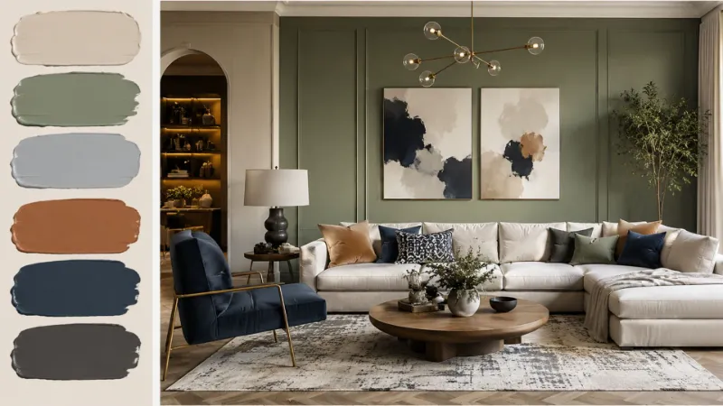
Staring at a blank wall, paint swatches fanned out on the floor, wondering if you’re about to make a very expensive mistake? You’re not alone. Choosing the right living room paint color is one of the most stressful and most transformative decisions in home decor, because this single choice sets the tone for how your entire space feels, functions, and photographs.
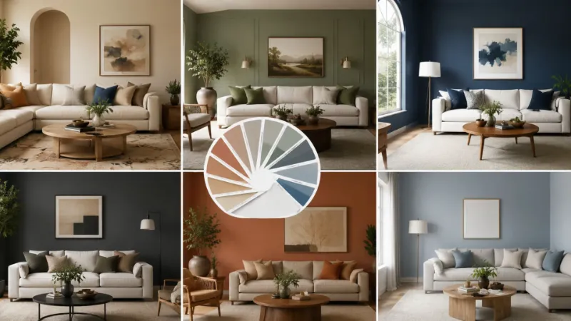
The good news is that you don’t need a design degree to get it right. This guide breaks down eight proven living room paint color ideas, backed by real-world testing, current design trends, and the kind of practical detail most articles skip. By the end, you’ll know exactly which paint color for living room walls suits your light, your furniture, and your lifestyle no guesswork required.
Warm Greige: The Safe Bet That Never Looks Boring
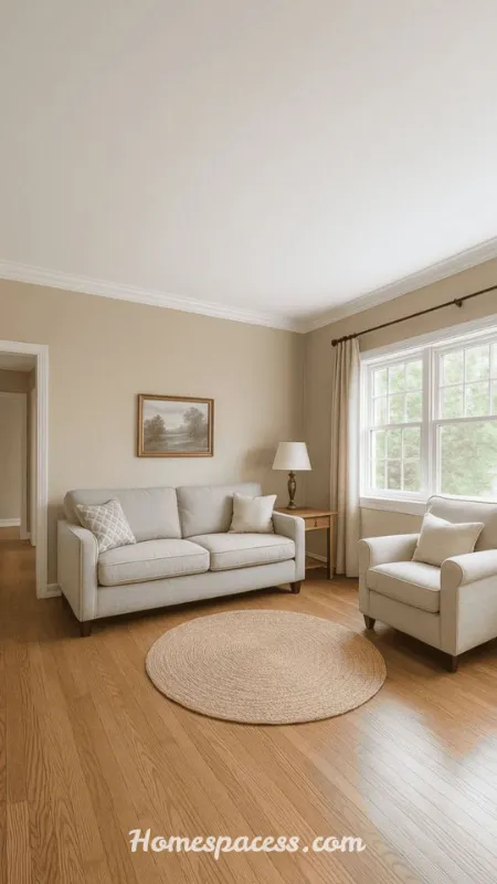
Greige a blend of gray and beige remains one of the most reliable living room wall colors because it adapts to almost any lighting condition. Unlike pure gray, which can turn cold and clinical under fluorescent bulbs, warm greige holds a soft beige undertone that keeps rooms feeling inviting even on overcast days.
Picture a north-facing apartment living room with limited natural light. A cool gray would emphasize the dimness, but a warm greige like Sherwin-Williams Agreeable Gray bounces available light around the room instead of absorbing it, making the space feel noticeably brighter by late afternoon.
| Style Note: Pair warm greige with brass or matte black hardware and natural wood tones to avoid a flat, monochrome look. |
| Pro Tip: Test greige swatches on at least two walls one facing the window, one away from it since undertones shift dramatically between direct and indirect light. |
See Related Articles: Small Living Room Decor Ideas: Smart Ways to Maximize Style and Space
Deep Forest Green for a Grounded, Nature-Inspired Feel
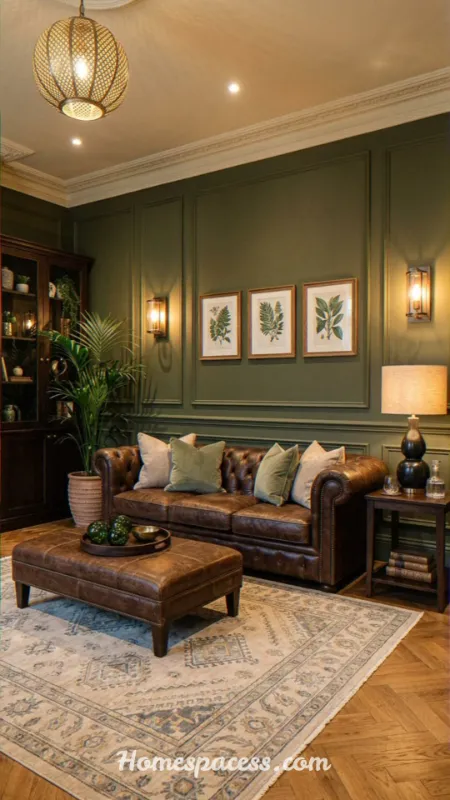
Dark green living room walls have moved from bold statement to mainstream favorite, and for good reason. Deep forest and hunter greens create a cocooning, editorial-magazine effect while still reading as timeless rather than trendy, which matters if you’re not repainting every two years.
In a recent client scenario, a small city living room with only one window felt cramped in white. Switching to a deep forest green on all four walls instead of a single accent wall actually made the room feel larger by removing the visual break between wall and ceiling, a trick professional decorators rely on for boxy rooms.
| Style Note: Keep trim and ceiling in a soft off-white to let the green read as intentional rather than cave-like. |
| Pro Tip: Use a satin or eggshell finish on dark greens; matte finishes can look patchy over larger wall areas. |
You May Also Like: Sitting Room Ideas: Stylish Ways to Design a Cozy, Functional Sitting Room
Soft Terracotta for Warmth Without Overwhelm
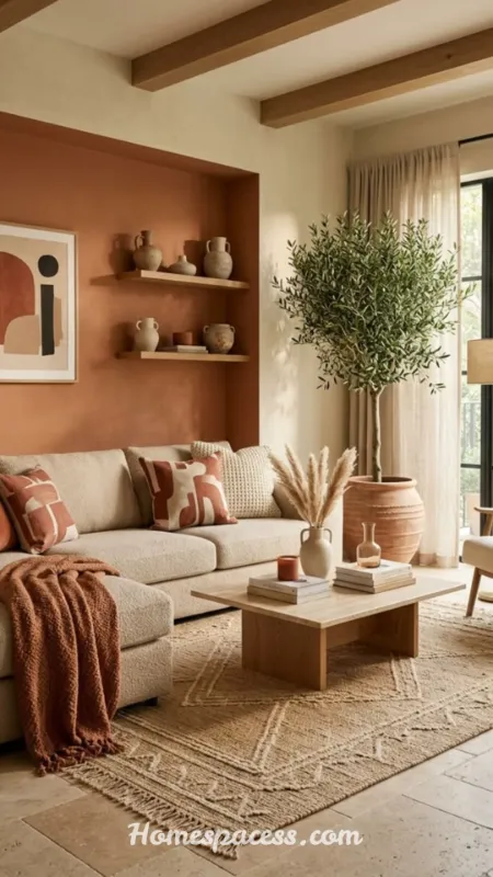
Terracotta living room paint brings earthy warmth that pairs beautifully with both mid-century and bohemian furniture styles. Unlike saturated orange, muted terracotta reads as sophisticated rather than juvenile, and it flatters warm-toned wood floors that many homeowners already have.
Consider a living room with honey-oak flooring that always felt slightly dated against cool white walls. Repainting in a dusty terracotta shade tied the flooring into the color story instead of fighting it, instantly making the whole room feel cohesive without replacing a single piece of furniture.
| Style Note: Balance terracotta with plenty of cream, sage, or rattan textures so the palette feels earthy rather than heavy. |
| Pro Tip: Apply terracotta on a single feature wall first if you’re unsure it’s far easier to expand a color than to undo four saturated walls. |
Recommended for You: Coffee Table Decor Ideas That Instantly Upgrade Your Living Room Style in 2026
Classic Navy Blue for Timeless Drama
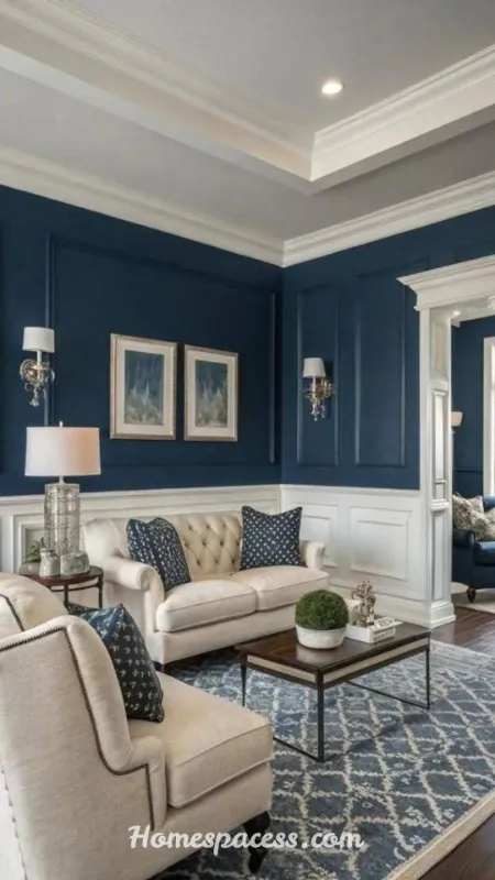
Navy blue living room ideas consistently rank among the most searched color choices, and the appeal is easy to understand: navy reads as formal enough for entertaining yet cozy enough for everyday movie nights. It also pairs with nearly every metal finish, from gold to chrome.
A common mistake is choosing a navy that’s too close to black, which can make small rooms feel closed in. A true mid-tone navy, tested in both morning and evening light, retains its blue character all day instead of flattening into near-black by sunset.
| Style Note: Layer navy walls with white or cream upholstery and a large mirror to keep the space from feeling too enclosed. |
| Pro Tip: Use a large 12×12 inch swatch board rather than a paint chip navy shifts more than almost any other color depending on sample size. |
Read Next: Colorful Living Room Ideas That Instantly Transform a Boring Space Into a Stunning One
Warm White and Off-White for Timeless Brightness
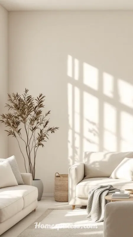
Not every trend favors bold color, and warm white living room walls remain the top choice for homeowners prioritizing resale value and light maximization. The key is avoiding stark, cool whites that can feel sterile warm whites with a hint of yellow or beige undertone keep rooms feeling soft rather than clinical.
In a south-facing living room that already receives strong sunlight, a cool white amplified the glare and made colors look washed out. Switching to a warm white with a subtle cream undertone softened the light instead, making the room feel calm rather than overexposed.
| Style Note: Layer warm white walls with varied textures linen, wood, wool so the room doesn’t feel flat or under-designed. |
| Pro Tip: Check the LRV (Light Reflectance Value); anything above 70 will maximize brightness in low-light rooms. |
More on This Topic: Stunning Living Room Carpet Ideas: Transform Your Space with Style, Comfort & Expert Insight
Muted Sage Green for a Calming, Versatile Backdrop
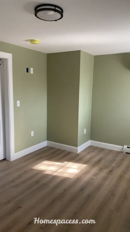
Sage green living room color schemes have become a favorite among designers because sage sits at the intersection of neutral and color it’s soothing enough to function like a neutral but distinctive enough to add personality. It also transitions seamlessly between seasons, unlike brighter greens.
For a living room that doubled as a home office, sage green reduced visual fatigue during long work sessions compared to the previous stark white, according to the homeowner’s own observation after repainting a small but telling real-world result that speaks to color psychology research on muted greens.
| Style Note: Combine sage with warm wood tones and woven textiles for an organic, spa-like atmosphere. |
| Pro Tip: Sage can lean gray or lean yellow depending on the brand always compare swatches from at least two paint lines before committing. |
See Also: Living Room Curtain Ideas for a Cozy and Modern Home Look
Charcoal and Deep Gray for a Modern, Moody Statement
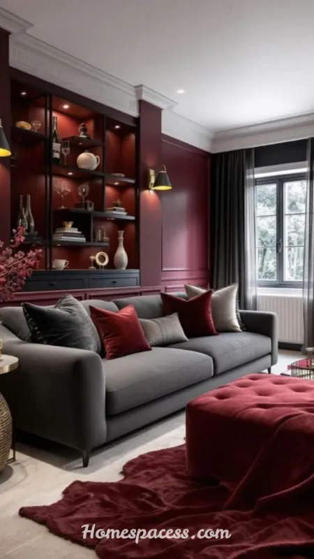
Charcoal living room walls deliver drama without the commitment of true black, and they photograph exceptionally well against brass, gold, or warm wood accents a major reason interior designers keep returning to this palette for editorial-style spaces.
A frequent concern is that charcoal will make a room feel smaller. In practice, charcoal on a room with high ceilings or large windows often has the opposite effect, drawing attention upward and outward rather than closing the space in, especially when paired with floor-length curtains in a lighter tone.
| Style Note: Reserve charcoal for rooms with strong natural light or supplement with warm, layered lamp lighting to avoid a dim, cave-like result. |
| Pro Tip: Use a low-sheen finish like matte or eggshell high-gloss charcoal exaggerates wall imperfections under lamp light. |
Further Reading: 22 Living Room Decor Ideas That Transform Any Space
Two-Tone and Color-Blocked Walls for a Custom Look
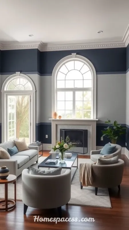
Two-tone living room paint ideas pairing a darker lower half with a lighter upper half, or color-blocking one wall give homeowners a custom, high-end look without hiring a muralist. This approach is especially useful in open-concept spaces where you want to visually define the living area.
In an open-plan apartment, color-blocking just the living room’s back wall in deep clay against otherwise white walls created a clear visual anchor for the seating area, helping the space feel zoned and intentional rather than one continuous, undefined room.
| Style Note: Keep color-blocked lines crisp with painter’s tape and a level; a slightly crooked line is far more noticeable in two-tone designs than in single-color walls. |
| Pro Tip: Use the 60-30-10 rule 60% dominant color, 30% secondary, 10% accent to keep two-tone schemes balanced rather than chaotic. |
Conclusion
Choosing the right living room paint color doesn’t have to be overwhelming once you understand how light, undertone, and furnishings work together. From warm greige to bold charcoal, each of these wall color ideas offers a distinct mood while staying practical for everyday living. The best next step is simple: grab two or three swatches that speak to you, test them on your actual walls, and watch how they shift throughout the day before committing to a gallon.
Advanced Insights & Expert Perspective
Trend Analysis: What’s Defining Living Room Colors in 2026
The 2026 paint color trends show a clear shift away from the all-gray, all-white palettes that dominated the last decade. Homeowners are gravitating toward what designers call “confident neutrals” warm, earthy tones like clay, olive, and mushroom that feel grounded rather than sterile, reflecting a broader desire for spaces that feel lived-in rather than showroom-perfect.
At the same time, saturated jewel tones like deep emerald and ink blue continue gaining traction as accent or full-room colors, particularly in smaller apartments where a single bold room creates maximum visual impact. This dual trend soft neutrals for daytime living, bold saturation for statement rooms reflects a broader move toward personalization over one-size-fits-all design formulas.
Expert Insights: How Professional Painters Choose the Right Shade
Professional painters rarely choose a color from a small chip alone. Instead, they test large sample boards at least 18×18 inches taped to multiple walls and observed across a full day, since natural light temperature shifts from cool blue in the morning to warm amber by evening, changing how a chosen wall shade actually reads.
Another overlooked technique is checking the color against fixed elements first flooring, countertops, and any built-in cabinetry before considering furniture, since furniture and decor are far easier to change than flooring. A shade that clashes with existing wood tones will always feel off, no matter how trendy it is.
Many professionals also recommend sheen strategy as much as color strategy: matte finishes hide wall imperfections but scuff easily in high-traffic living rooms, while eggshell and satin finishes offer a practical middle ground of durability and softness for busy households.
Long-Term Value: Choosing Colors That Support Resale and Longevity
From a strategic standpoint, living room wall colors with broad appeal warm whites, soft greiges, and muted greens tend to support resale value better than highly saturated or trend-specific colors, since buyers can more easily picture their own furniture in a neutral space during showings.
That said, longevity isn’t only about resale. A well-chosen deeper color, like navy or charcoal, can actually save money over time because it hides scuffs and wear better than pale colors in high-traffic living rooms, reducing how often touch-up painting is needed between full repaints.
Future Predictions: Where Living Room Color Trends Are Heading
Looking beyond 2026, expect paint color innovation to increasingly intersect with technology low-VOC and zero-VOC formulations are becoming the industry standard rather than a premium upsell, driven by growing consumer demand for healthier indoor air quality in spaces where families spend the most time.
Color-changing and mood-responsive paint technology, while still niche, is also moving from novelty to early adoption in some markets, alongside AI-assisted color-matching tools that let homeowners preview a chosen shade against a photo of their actual room before buying a single can reducing the costly trial-and-error that has traditionally defined paint shopping.
Common Mistakes to Avoid When Choosing Your Living Room Wall Color
The most frequent mistake is skipping the sample stage entirely and trusting a tiny paint chip or an online product photo, both of which are notoriously unreliable due to screen calibration and printing variance. A color that looks perfect on a phone screen can read completely differently once it covers four full walls.
A second common oversight is ignoring the ceiling and trim. Painting walls without considering how the new color interacts with an existing white or cream ceiling can create an unbalanced look, especially with darker wall colors that need a lighter ceiling to keep the room from feeling like it’s closing in overhead.
Finally, many homeowners underestimate how much artificial lighting changes a color at night. A shade that looks flawless under daylight can turn muddy or flat under warm incandescent bulbs, so it’s worth checking your chosen wall color after dark before finalizing it.

Team Home Spacess shares simple, practical design ideas that work for real families. The team focuses on cozy décor, soft colors, and natural textures that make a space feel truly lived-in. From everyday decorating tips to creative home projects, Team Home Spacess is dedicated to helping readers create warm, comfortable, and inviting spaces with a fresh and personal touch.